Contains the descriptions of all property pages used to configure line, bar, and x-y charts.
The Layout Page
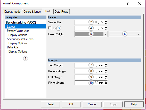
The layout page contains controls to define the margins of the chart's inner part to the component frame and the basic measures to use.
Control Elements:
1
Select a category or section of the current component here.
2
Specify the percentage of available space to use as size for bar graphs
3
Check to display a line at a given percentage of the scale
4
Set the position of the line relative to the scale width
5
Select a color for the line
6
Select a style for the line
7
Specify the top margin relative to the component edges
8
Specify the bottom margin relative to the component edges
9
Specify the left margin relative to the component edges
10
Specify the right margin relative to the component edges
The Axis Page
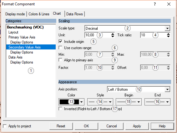
The Axis Page controls the value range, unit and display position of an axis in a chart.
Control Elements:
1
Select a category or section of the current component here.
2
Select a scale type for the axis (decimal, logarithmic, percentage)
3
Set the unit (major ticks) for the axis
4
Set the tick ratio (number of minor ticks for each major tick)
5
Check to make sure that the value 0 is in the automatically calculated range of the axis
6
Check to specify a custom range for the axis
7
Edit the minimum of the axis range
8
Edit the maximum of the axis range
9
For secondary axes: set range relatively to range of primary axis
10
Set the scale factor for calculating the range of a secondary axis from the primary axis
11
Set the offset for calculating the range of a secondary axis from the primary axis
12
Select a display position for the axis
13
Select the color for the axis, ticks, and arrow
14
Select a line style for the axis
15
Select an arrow for the starting point of the axis
16
Select an arrow for the end point of the axis
17
Check to mirror the axis
The Axis Display Page
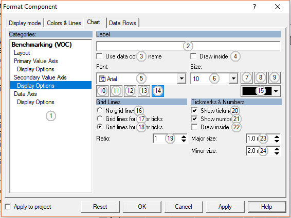
The Axis Display Page contains controls to set more options to draw axes in a chart.
Control Elements:
1
Select a category or section of the current component here.
2
Enter the text to show near the axis
3
Check to use the name of the underlying data column as label
4
Show axis labels above / right of the axis
5
Choose a font name
6
Choose or edit a font size. Sizes are given in points.
7
Use bold font
8
Use italic font
9
Underline text
10
Text bottom up
11
Text upside down
12
Text from left to right
13
Text top down
14
Enable automatic line breaks
15
Click here to select the text color.
16
Do not show grid lines
17
Show grid lines at each minor tick
18
Show grid lines for each major tick
19
Ratio of grid lines to ticks (grid lines for each x'th tick)
20
Show tick marks
21
Show value for each major tick
22
Show ticks above / right of axis
23
Size of minor ticks in mm
24
Size of major ticks in mm
The Line Chart Page
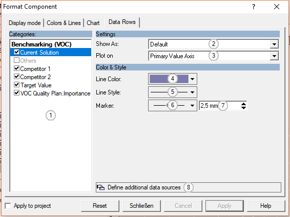
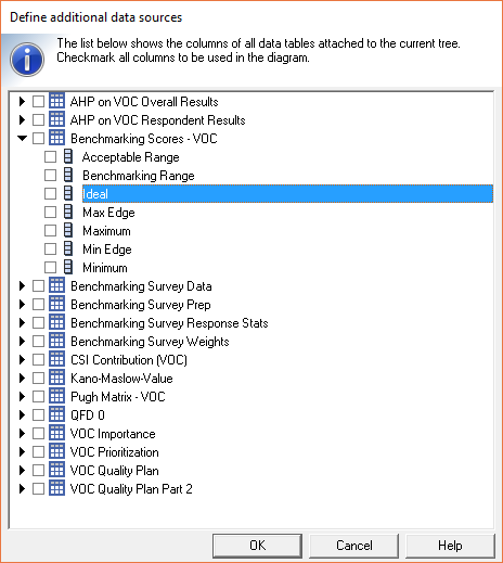
This page contains controls to setup the style and color for each data row in a line chart. Table columns of the underlying table can be hidden and columns from other tables can be imported into the diagram.
Control Elements:
1
Select a table column here. Use the checkbox to enable / disable a column.
2
Choose the display type for this data columns. Default refers to the basic type of the chart: lines or bars. Choose another type to override this basic type.
3
Choose either the primary or secondary value axis.
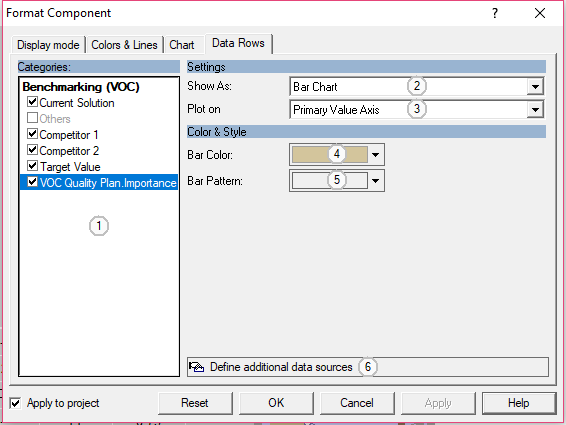
This page contains controls to define color and style for bar charts as well as controls to change the chart type for a data row and to add new data rows.
Control Elements:
1
Select a category or section of the current component here.
2
Choose the display type for this data columns. Default refers to the basic type of the chart: lines or bars. Choose another type to override this basic type.
3
Choose either the primary or secondary value axis.
 English
 German