Basic rendering options for trees, matrices, and other components
This chapter contains descriptions for the basic rendering options of all components.
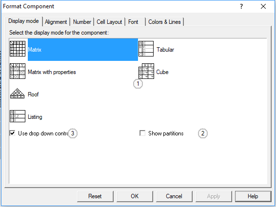
The Automatrix Page
This page contains controls to select the basic rendering type for auto matrices and offers controls for some additional options.
Control Elements:
1
Choose one of the possible rendering types
2
Check to show red frames around partitions
3
Check to force usage of drop down control for symbol cells
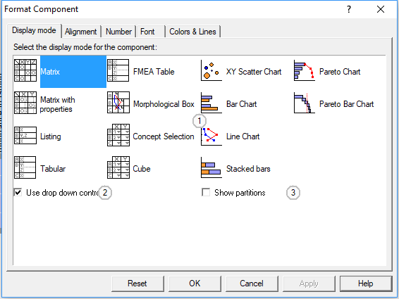
The Matrix Page
Control Elements:
1
Choose one of the possible rendering types
2
Check to force usage of drop down control for symbol cells
3
Check to show red frames around partitions
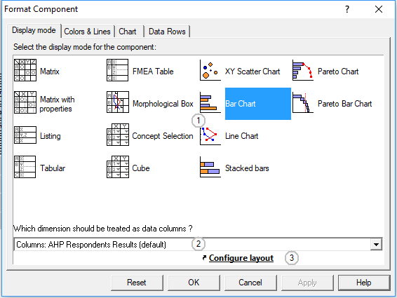
The Chart Page
This page contains controls to setup the basic type of a chart or to go back to a grid or table-like rendering
Control Elements:
1
Choose one of the possible rendering types
2
Select a dimension of the tensor to mark the data rows
3
Click to change to the layout page
See Also...
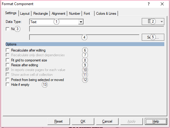
The Field Page
Control Elements:
-
2
Choose options for enumerations
3
Check to define value as project variable
4
Shows the qualified name of a variable
5
Click to browse for a project variable
6
Check to start recalculation every time the value of the box changes
7
Check to restrict recalculation to the direct dependencies
8
Check to adapt internal layout to frame size
9
Check to adapt frame size to value
10
Check to use this box to create variants
11
Check to display one single cell of a tensor instead of tensor properties
12
Check to avoid moving or resizing
13
Check to hide the whole box if there was no value
The Tree Page
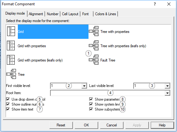
This page contains control elements to set the display options for trees
Control Elements:
1
Choose one of the possible rendering types
2
Enter or choose the first details level visible in this component
3
Enter or choose the last details level to be displayed by the component
4
Choose a node of the tree to be used as display root
5
Check to force usage of drop down control for symbol cells
6
Check to show number prefixes for each item
7
Uncheck if you want to see outline numbers exclusively
8
Check to show parameter elements (for trees that have both system elements and parameters)
9
Check to show system elements (for trees that have both system elements and parameters)
10
Check to extend the tree using compatible trees in sub projects
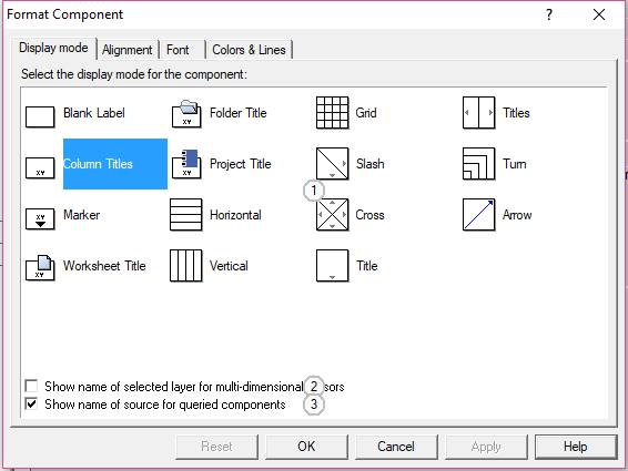
The Label Page
The label component can be used to fill empty spaces in worksheets and to show titles or other information about neighbouring components. This page lets you choose one of the basic display configurations and additional options for labels. Use the rotate command for additional layout configurations.
Control Elements:
-
2
If sibling component has a z-dimension, show name of current layer
3
Check to use original names instead of query names
The Legend Page
This page lets you choose which kind of information a legend would show about the component it is linked to. Additional layout options can be set on the lower part of the page. Possible display types depend on the type of the linked component, e.g. bar charts, matrices, lists.
Control Elements:
1
Choose one of the possible rendering types
2
Set the number of text columns in the legend
3
Check to disable automatic line breaks
4
Check to show the name of the linked component in the first line
 English
 German